
My Red Dress Lesson: How the Color You Wear Makes You Pop or Disappear in Photos
Same bench, same evening light, two very different results.
Here's what I learned about clothing color, pattern, and contrast when I let Christine borrow my red dress.
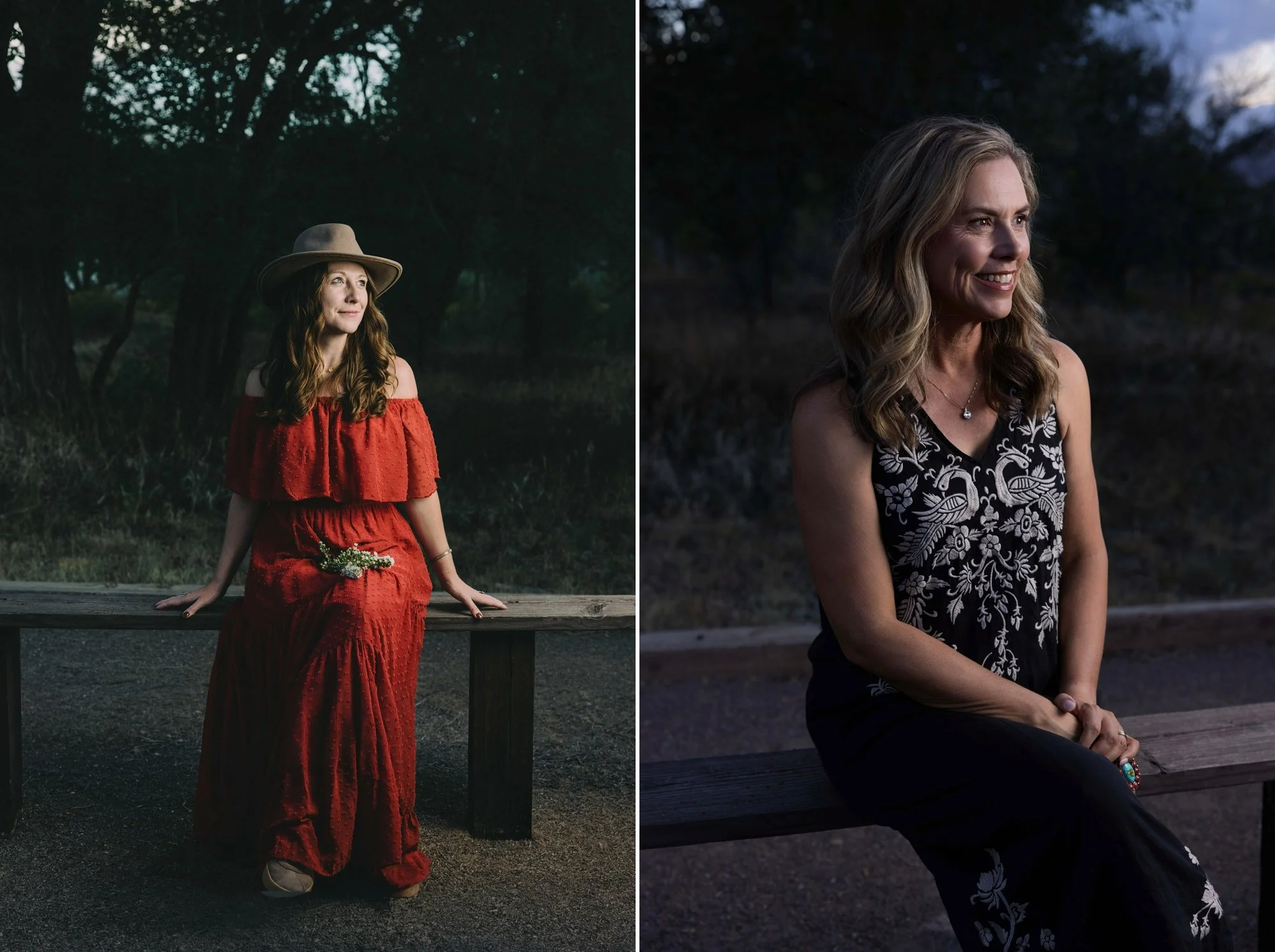
What a difference this makes! Christine POPS and I don’t know what….Wrong color dress and busy pattern makes the eye get confused fast. Photo credit: Christine Mary Photography for my portrait and photo credit to me for Christine’s portrait.
Key Takeaways
The right clothing color separates you from the background. The wrong one makes you blend in.
Start with your personal color palette, then layer in your brand colors.
Choose a color that contrasts with your location. Dark on dark disappears.
Solid colors and subtle textures photograph better than busy, high-contrast patterns.
True black and bright white are the hardest colors to photograph well, especially in low light.
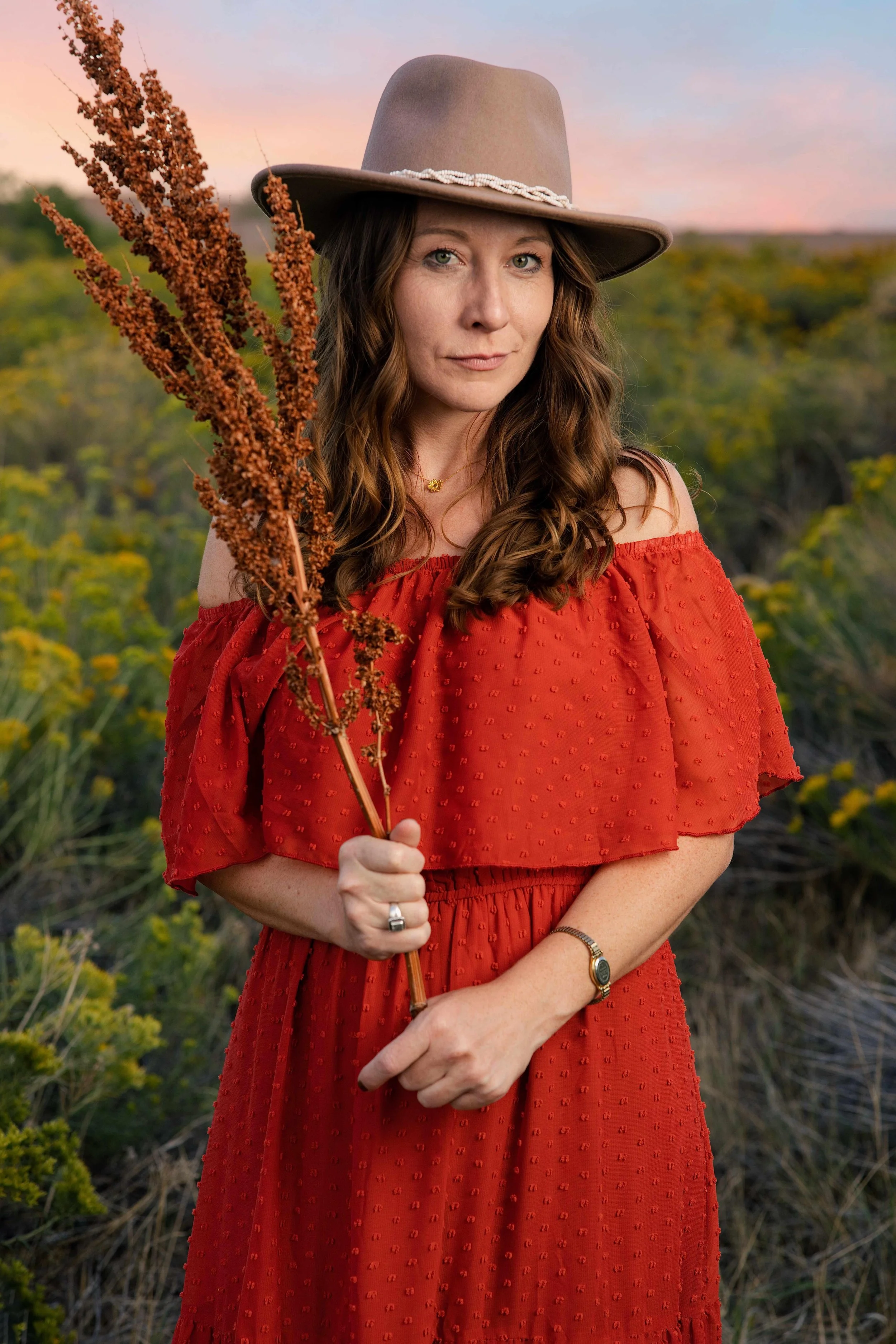
Photo Credit: me; I love this portrait!
The Photos that Changed How I Think about Color
I've been a personal branding photographer since 2011, and I help clients choose their wardrobe for every session. So I'll admit it: this lesson humbled me.
As part of my own branding session, Christine and I decided to take some outdoor portraits in the evening light. She hadn't packed anything to wear, so she borrowed my red dress. I've worn that dress for years and was ready for a break from it.
When I pulled up the images, the difference stopped me in my tracks. We sat on the same bench, in front of the same trees, in the same light. Christine pops. I disappear.
Why Do Some People Pop in Photos While Others Blend In?
Short answer: People pop in photos when their clothing contrasts with the background in color and brightness, flatters their natural coloring, and doesn't compete with their face. When your outfit is close in tone to your surroundings or carries a busy pattern, the eye goes to the setting or the print instead of you.
In my photo, I'm wearing a black Johnny Was dress with cream embroidery. The black is nearly the same darkness as the trees behind me, so my shape fades into the shadows. And the cream embroidery is the brightest, highest contrast element in the frame, so it pulls your eye to my chest instead of my face. Honestly, the most colorful thing in my portrait is my turquoise ring.
Christine's rust dress is warm, saturated, and solid. It stands apart from the green landscape and the cool blue and pink sky. Orange and green sit across from each other on the color wheel, so they make each other more vivid. The result: she's the first thing you see.
What is a Personal Color Palette, and Why Does it Matter for Photos?
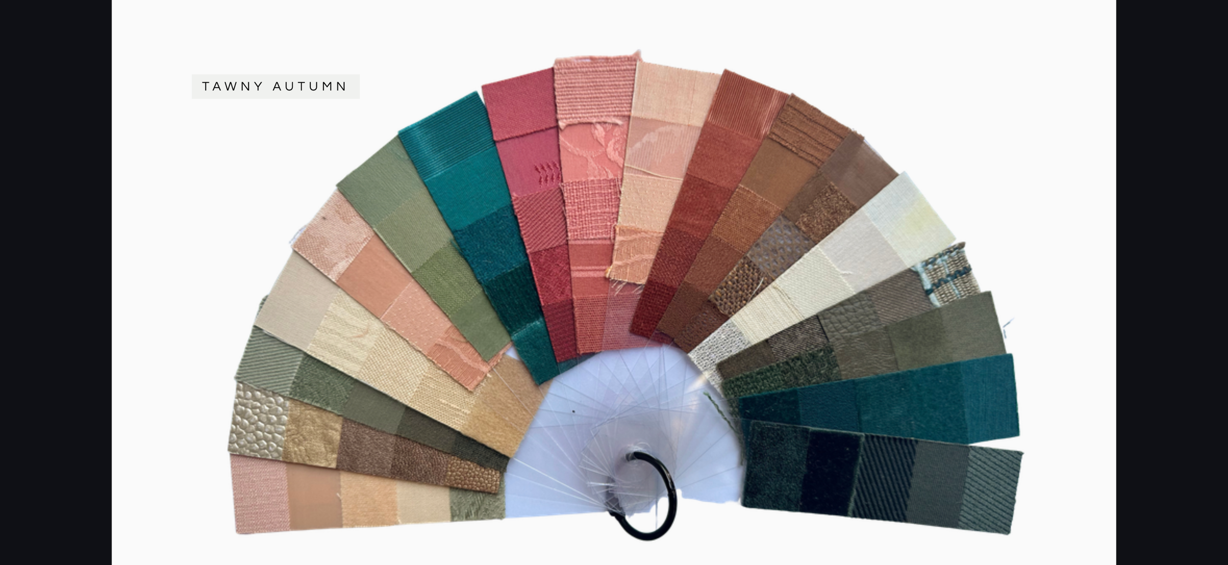
Short answer: A personal color palette is the group of colors that harmonize with your skin undertone, hair, and eyes. Colors from your palette make you look rested and healthy on camera, while colors outside it can create shadows, sallowness, or redness, even with great lighting and makeup.
Personal color analysis looks at three things: whether your coloring is warm or cool, light or deep, and bright or soft. My palette is Tawny Autumn: warm, muted, and medium in depth; think olive, teal, terracotta, brick, camel, and cream.
Here's the twist that made me laugh. That rust red dress lives right in my own palette. I'd been wearing a winner for years and didn't fully appreciate it until I saw it on someone else. Christine's auburn hair and green eyes share that same warmth, which is why the dress looks so natural on her.
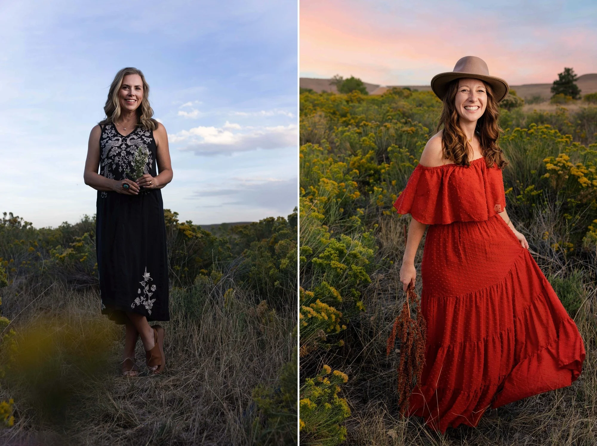
The dress pattern became the main subject. Whereas Christine harmonizes and pops with the landscape. Photo credit: Christine Mary Photography for my portrait and Photo Credit for Christine is me.
Should my Outfit Match my Brand Colors?
Short answer: Your outfit should harmonize with your brand colors, not match them exactly. Choose at least one look from your personal palette that sits comfortably next to your brand colors, then bring in exact brand colors through props, backgrounds, accessories, or your workspace.
When your photos and your brand share a color story, your website, social posts, and marketing materials feel cohesive. A website rebrand is often the reason clients come to me: their old portraits no longer feel at home next to new fonts and colors. When your personal palette and brand palette overlap, you get the best of both.
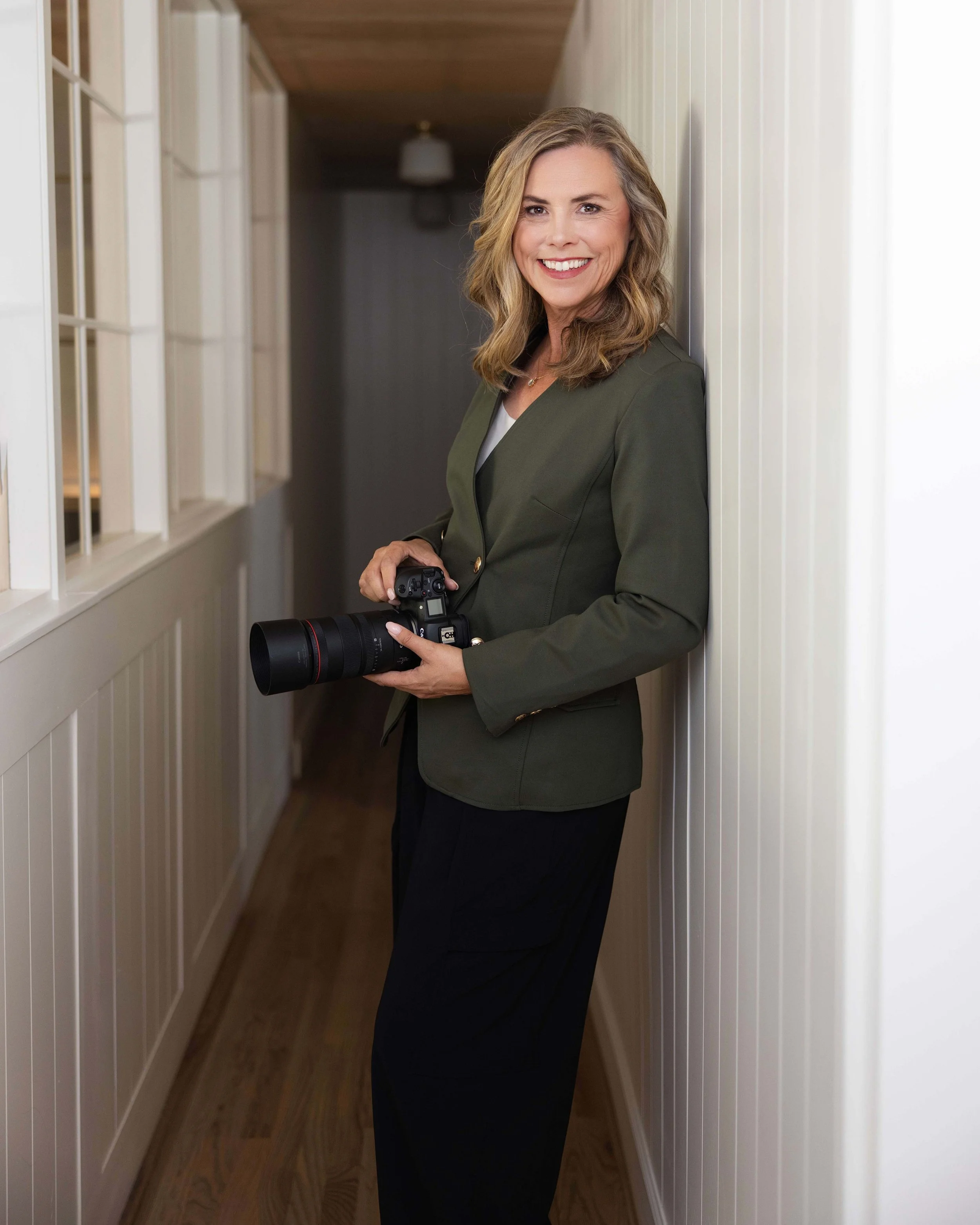
I had my branding colors redone to match my personal palette. So much easier that way. Photo credit: Christine Mary Photography
Should I Wear Patterns or Solid Colors in Branding Photos?
Short answer: Solid colors are almost always the safer choice. Bold or high contrast patterns compete with your face, date your photos faster, and can create a shimmering effect on screens. If you love pattern, keep it small and low contrast, or choose texture instead.
Texture is your secret weapon. Look closely at Christine's dress and you'll see tiny swiss dots. From a distance, it reads as a rich solid color. Up close, it adds depth and interest. Knits, linen, suede, corduroy, and soft ribbing all do the same thing.
My embroidered dress is beautiful in person. On camera, the cream on black contrast is so strong that it becomes the subject of the photo.

Photo credit: Christine Mary Photography
Is it Okay to Wear Black in Photos?
Short answer: Black can work in photos, especially in bright, even light or against a light background. In low light or against dark backgrounds, black absorbs light, loses detail, and makes your body shape disappear. Softer deep neutrals like espresso, charcoal olive, deep teal, or navy usually photograph with more dimension.
The same goes for bright white. It can glow and pull attention away from your face. Ivory, cream, and oatmeal are much kinder on camera.
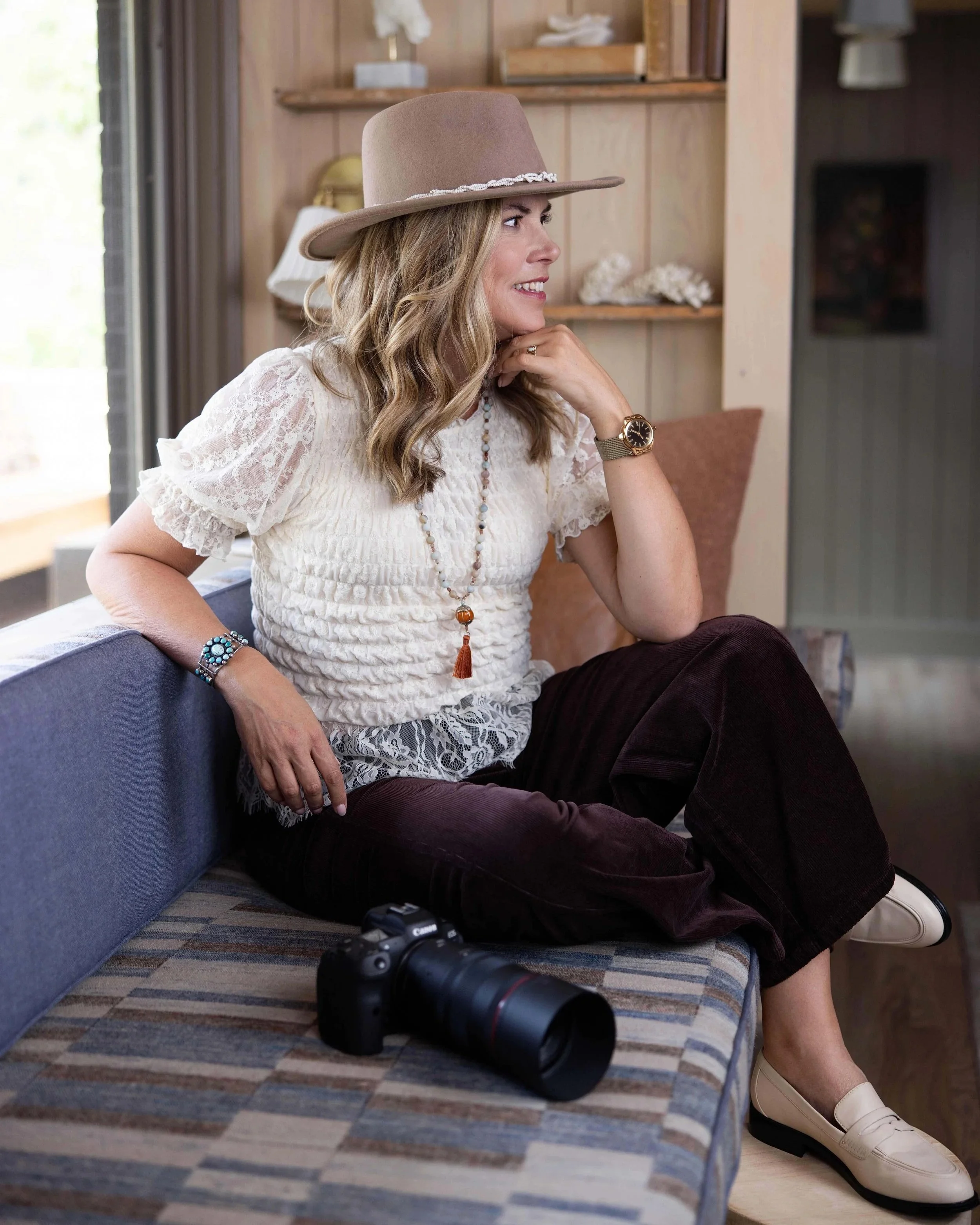
Cream is the color of my blouse and harmonizes with the environment. Photo credit: Christine Mary Photography
How do I Choose the Right Outfit Color for My Location?
Short answer: Choose a color that contrasts with where you'll be standing. Warm colors like rust, terracotta, and mustard pop against green fields and blue skies. Deeper or jewel tones stand out against pale walls and light interiors. Avoid wearing the same tone and brightness as your background.
Before your session, ask your photographer where you'll be photographed and what time of day. Evening light is warm and golden. Shade and dusk are cooler and darker. A color that works in a white studio may vanish on a wooded trail.
A Simple Test You Can Do at Home: The Squint Test
Put on your outfit, stand in a spot similar to your location, and have someone take a quick phone photo. Then squint at the photo until it gets blurry. Whatever jumps out first is what people will notice first. You want that to be you, your face and your silhouette, not your print, your shoes, or the background.
Quick Checklist: What to Wear for your Branding Portraits
Choose colors from your personal palette
Include at least one look that harmonizes with your brand colors
Pick colors that contrast with your location
Favor solids and subtle textures over busy prints
Use true black and bright white sparingly, especially in low light
Choose necklines that frame your face - I recommend V-necks
Bring two or three options so your photographer can help you choose (applies to Headshot Events)
Add one meaningful accessory, like a statement ring or hat, rather than many
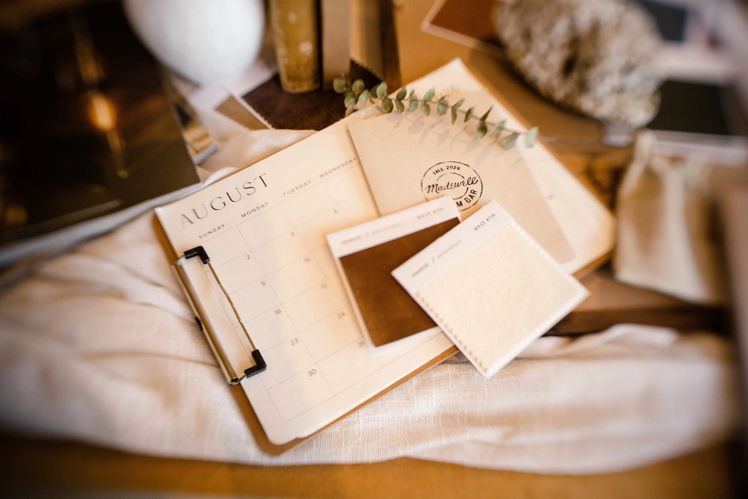
Color harmony make all the difference. Photo credit: Christine Mary Photography
Frequently Asked Questions
What colors look best in branding photos? The colors that look best are the ones in your personal palette that also contrast with your background. For many people, rich mid-tones like teal, rust, olive, berry, camel, and cobalt photograph beautifully because they hold detail and add warmth to skin.
What colors should I avoid in photos? Avoid colors that match your background, neon shades that cast color onto your skin, and, in low light, true black. Bright white can also overpower your face. Colors outside your personal palette can make you look tired and older than you are.
Should I wear patterns in my headshots? Usually no. Solids keep the focus on your face. If you want interest, choose texture or a small, low-contrast pattern.
How many outfits should I bring to a branding session? The Wardrobe Stylist will meet with you ahead of time to select your five outfits. :
Do I need a personal color analysis before my photo shoot? It isn't required, but it helps. Even without a formal analysis, notice which colors earn you compliments. Those are often clues to your palette.
Wardrobe Styling Makes a Major Difference
If a photographer who has helped hundreds of clients choose their wardrobe can still miss this on herself, it's not a you problem. It's hard to see your own colors clearly. That's exactly why every personal branding session I photograph includes wardrobe styling, plus camera-ready hair and makeup, so your clothes support you instead of competing with you.
Ready to look like you on camera? Book your branding session or reserve your spot at the Richmond Headshot Party.
About the author Kim Brundage is an award-winning traveling personal branding and executive portrait photographer serving entrepreneurs, coaches, speakers, and executives in Denver, Scottsdale, and Richmond. In business since 2011, she has earned 190+ five-star Google reviews. Her signature sessions include wardrobe styling, camera-ready hair and makeup, and a portrait experience designed to take you from nervous to radiant.